
help users learn about hūmNET through effective site content, visuals, and interactions
promote hūmNET as a valuable, trustworthy product to potential users and investors
solution
by identifying and balancing user needs and business goals, i created a new landing page website to promote hūmNET's new product, boosting interest to download the app by 10%.
before

after (scroll to solution)

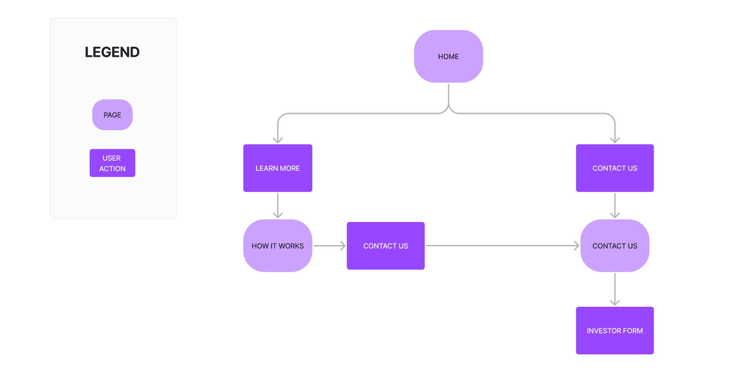
user flow
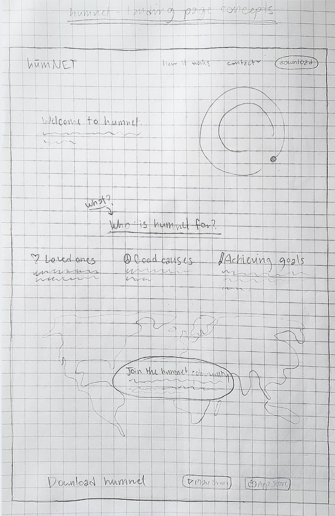
low-fi explorations
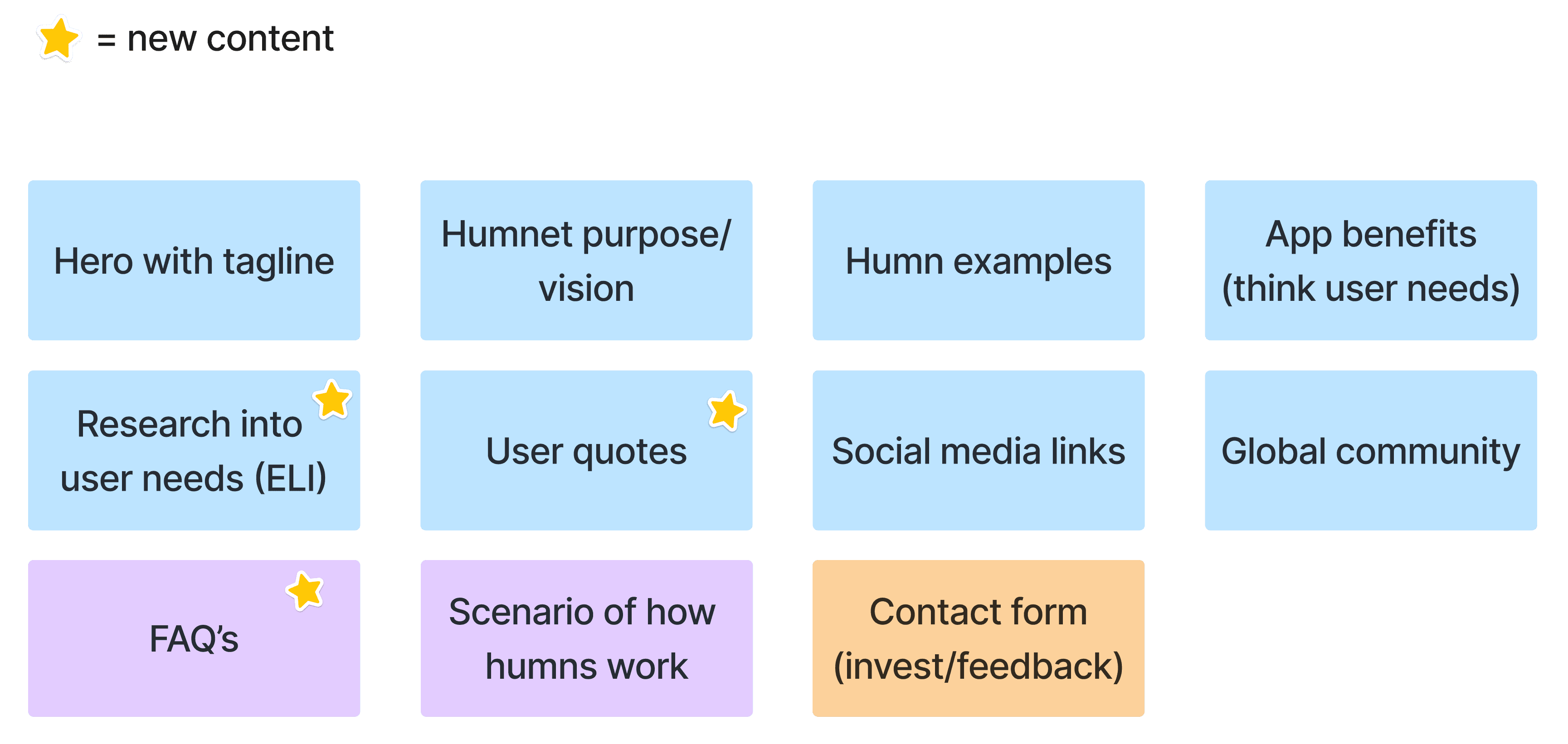
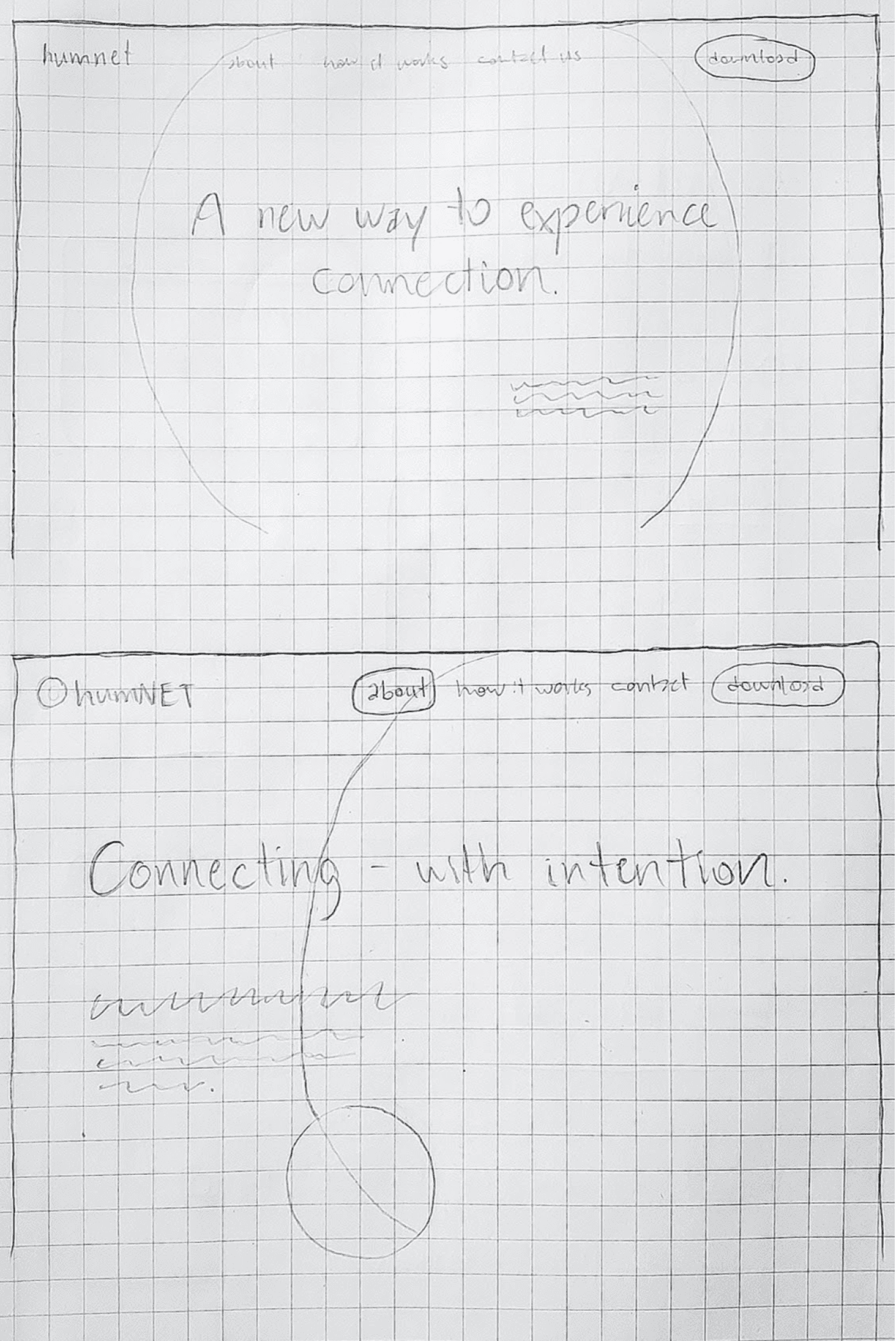
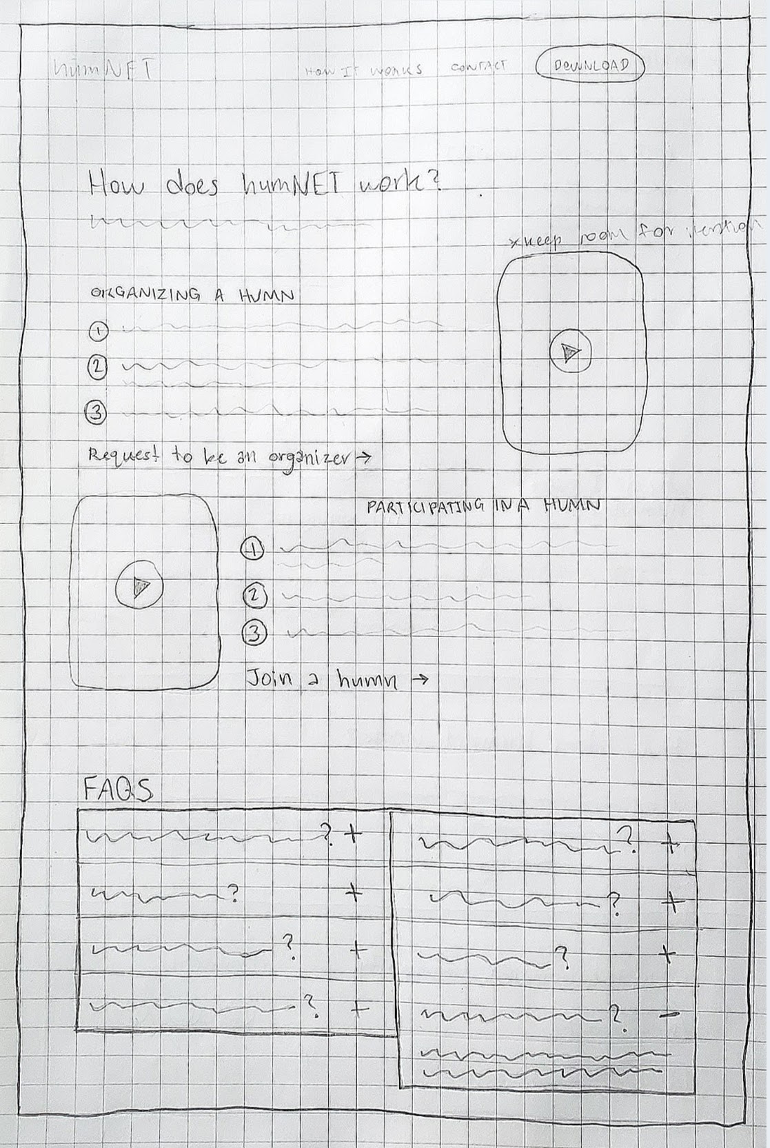
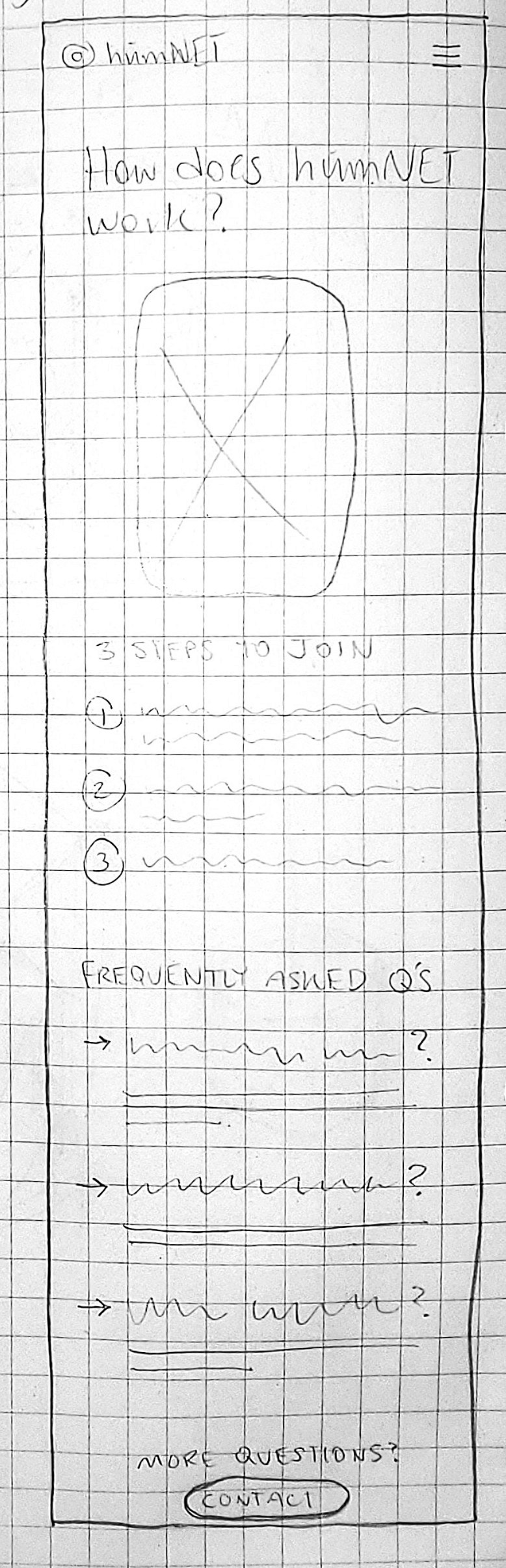
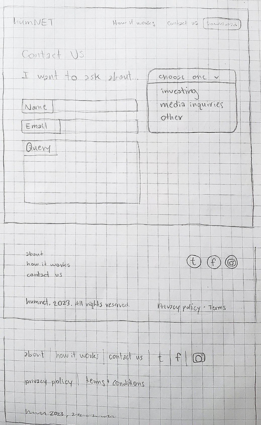
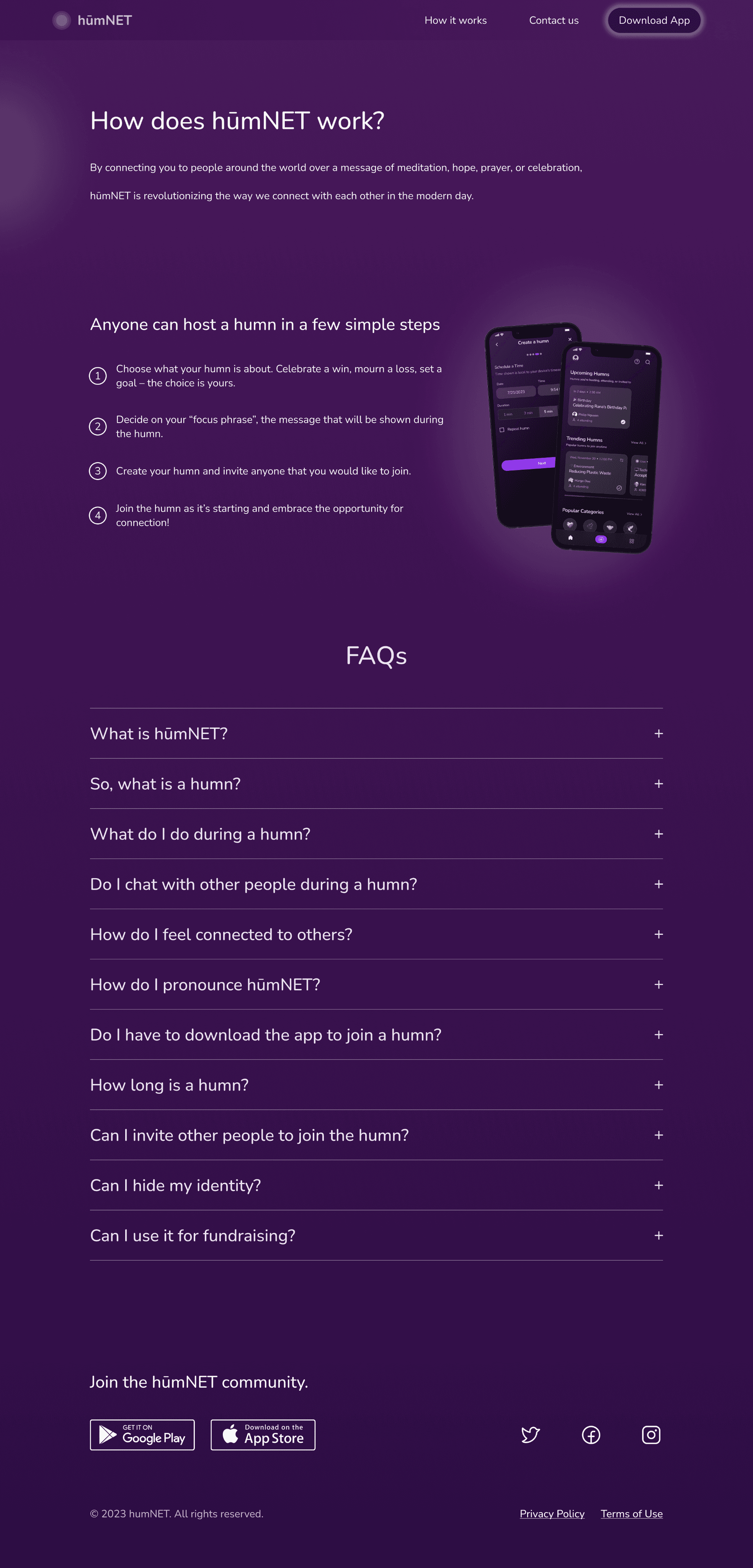
after ensuring that my client and i were on the same page, i began sketching out ideas for the three site pages, accounting for both desktop and mobile sizes.
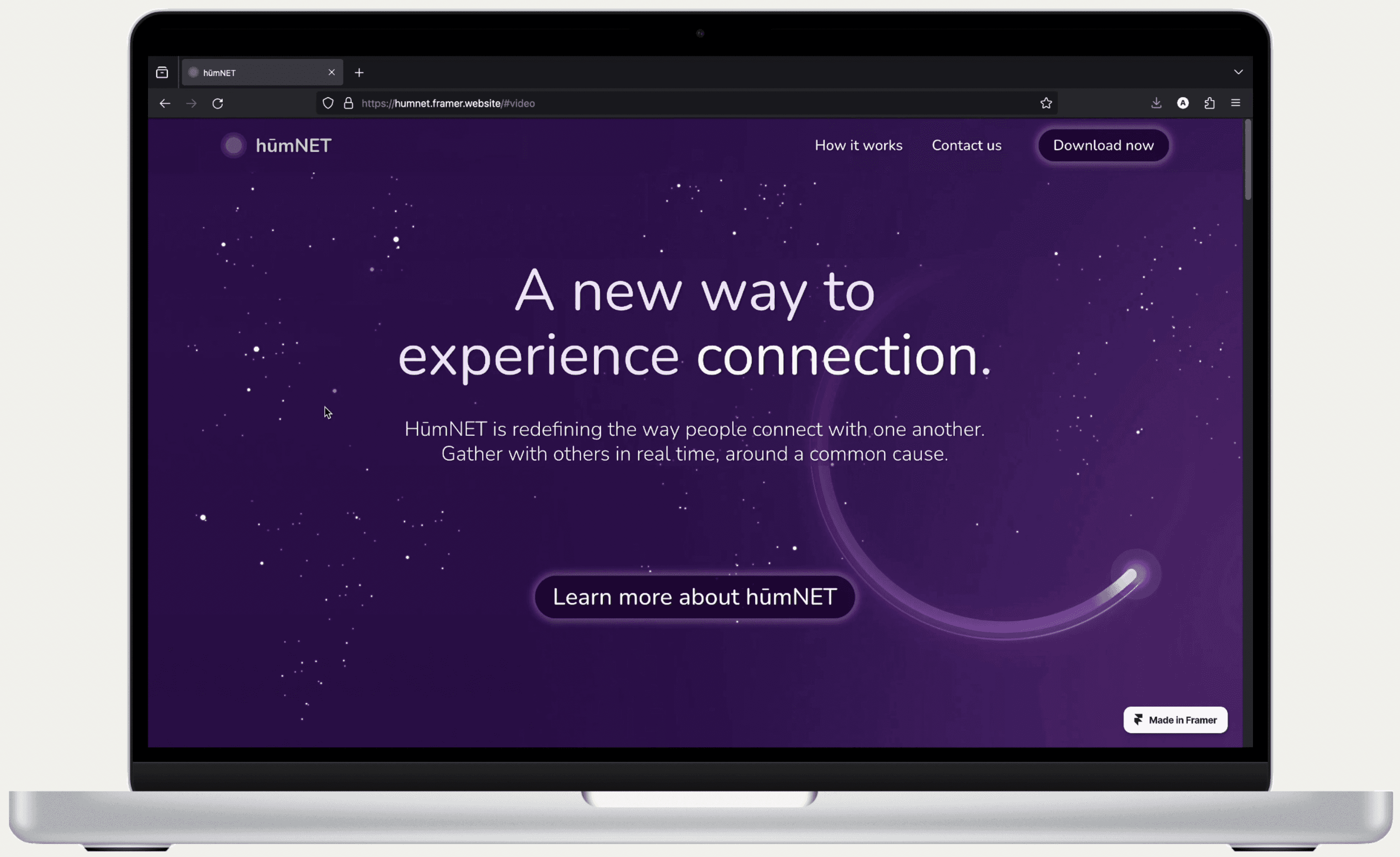
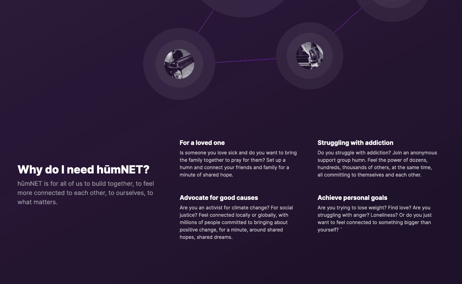
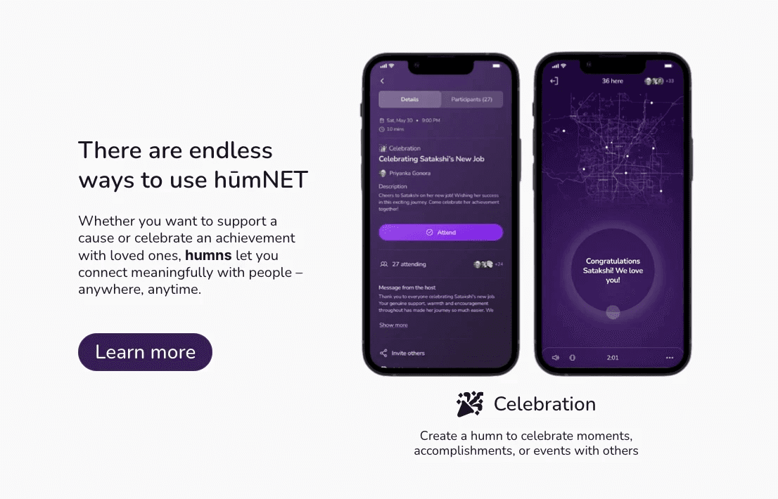
home page
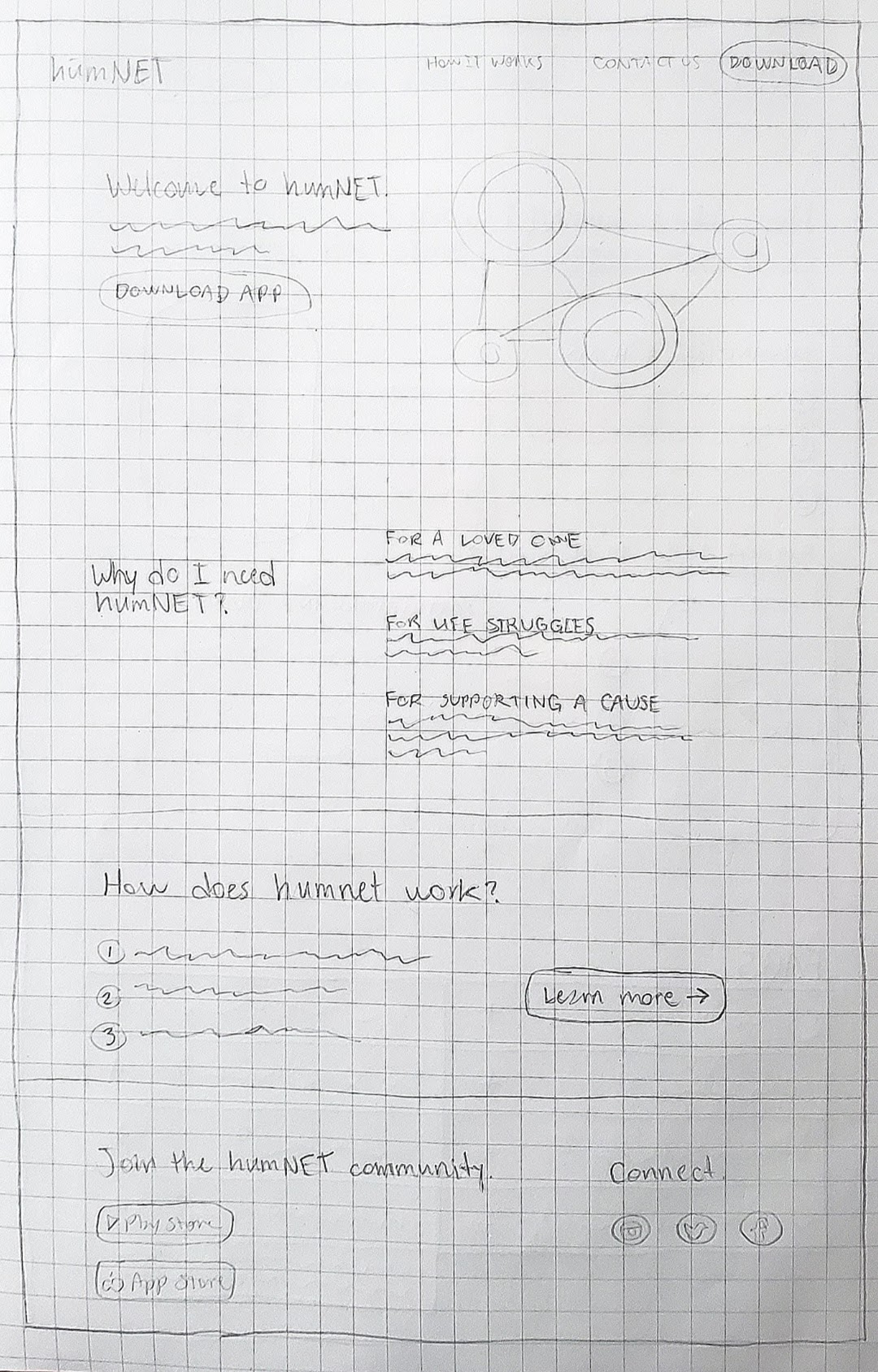
hero section
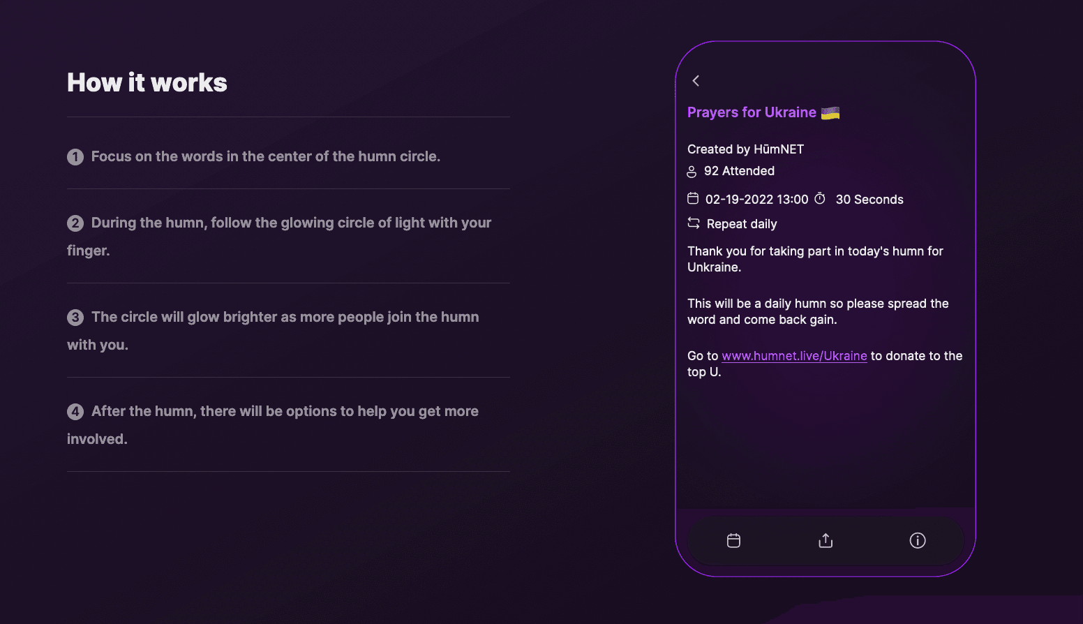
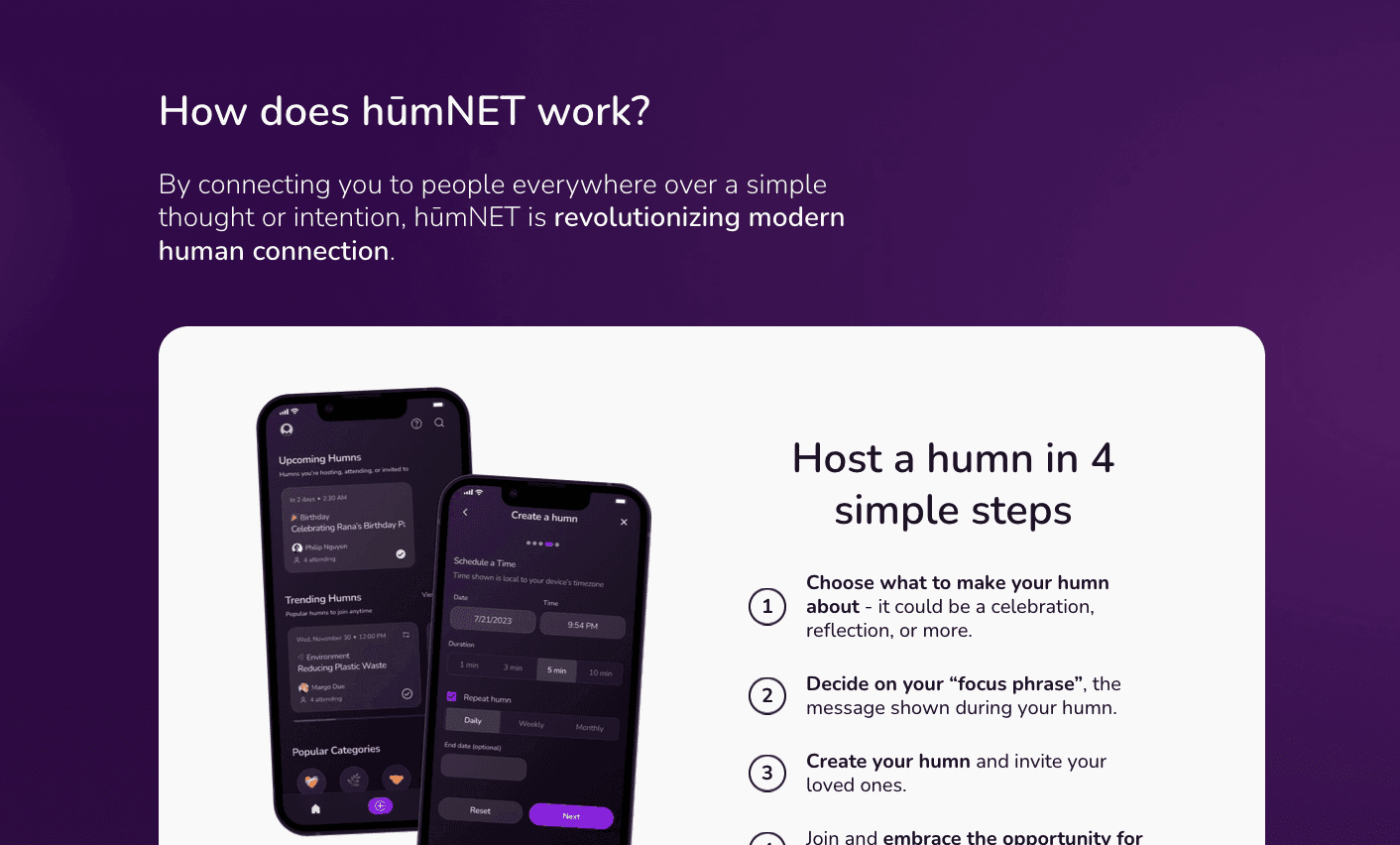
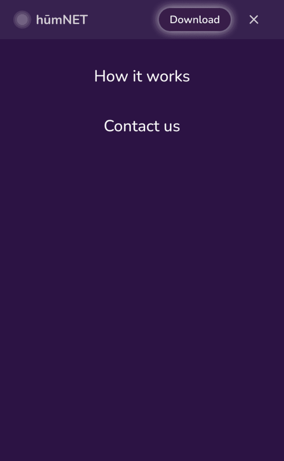
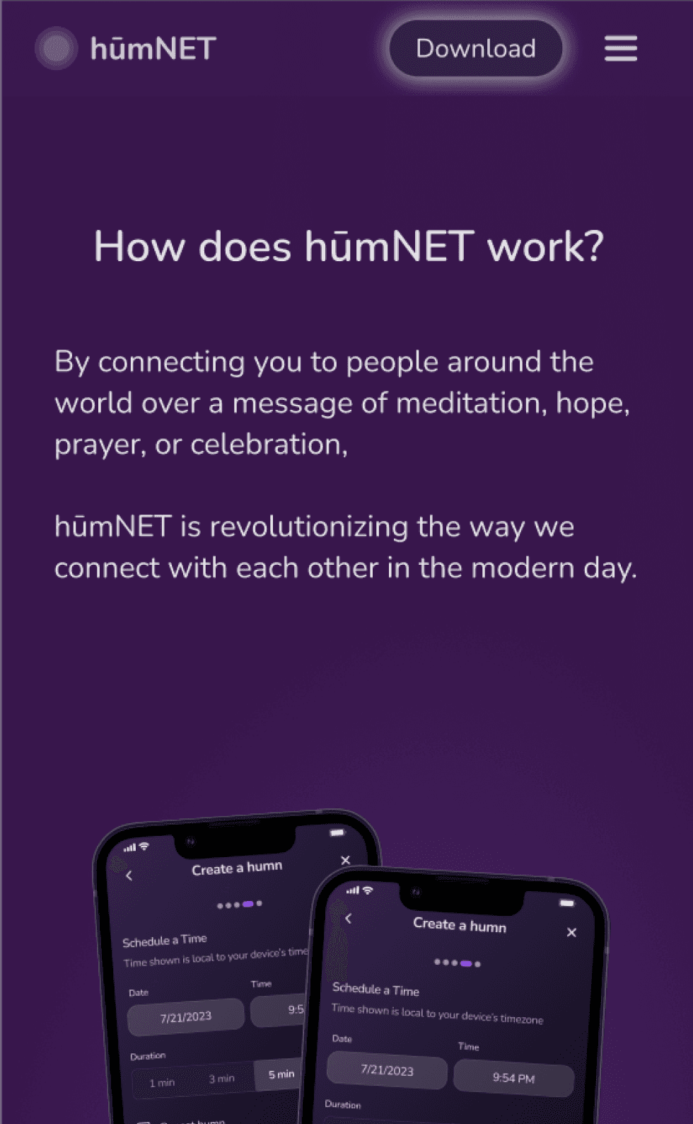
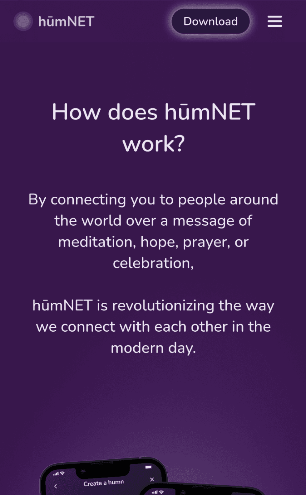
how it works page
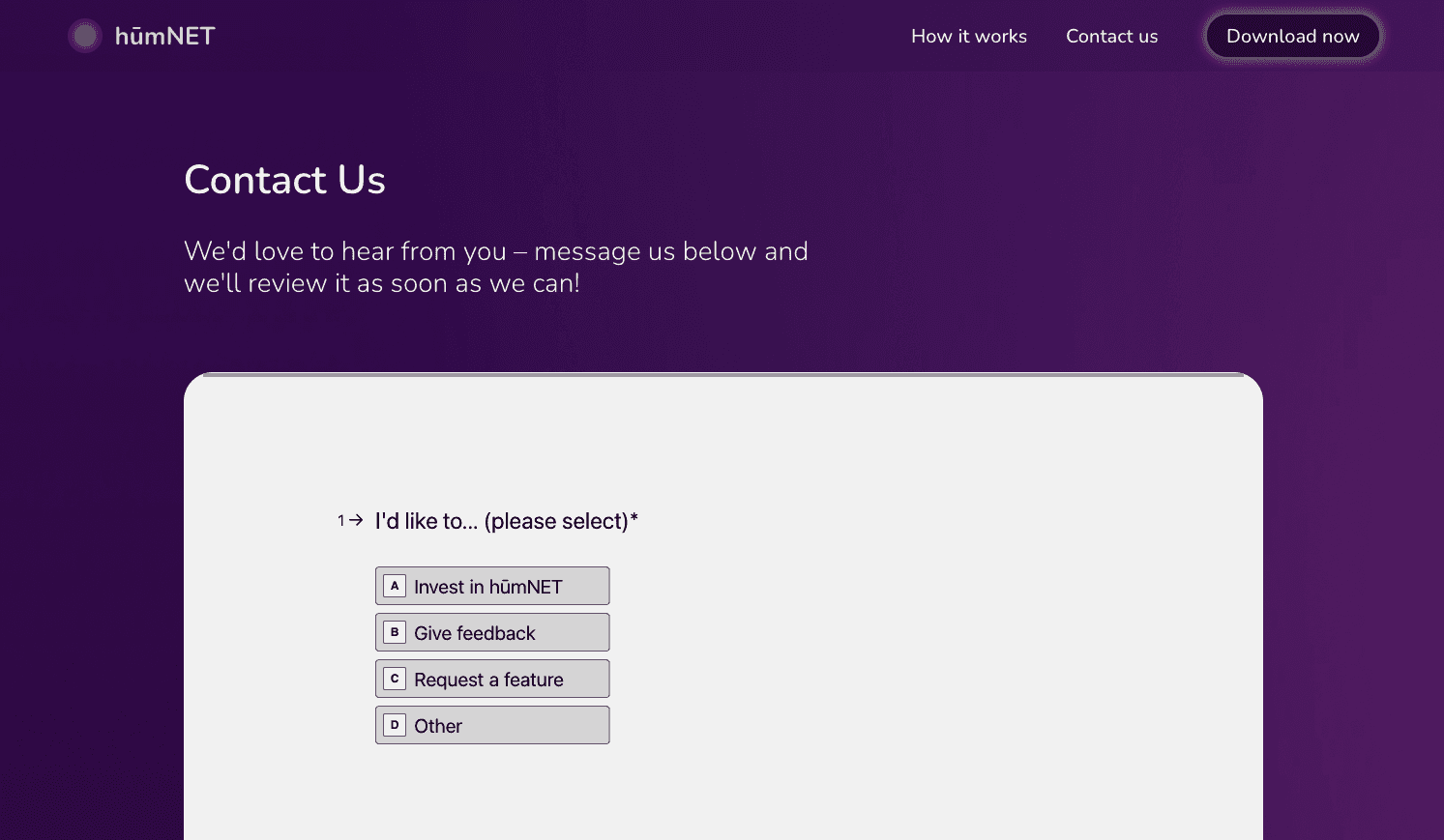
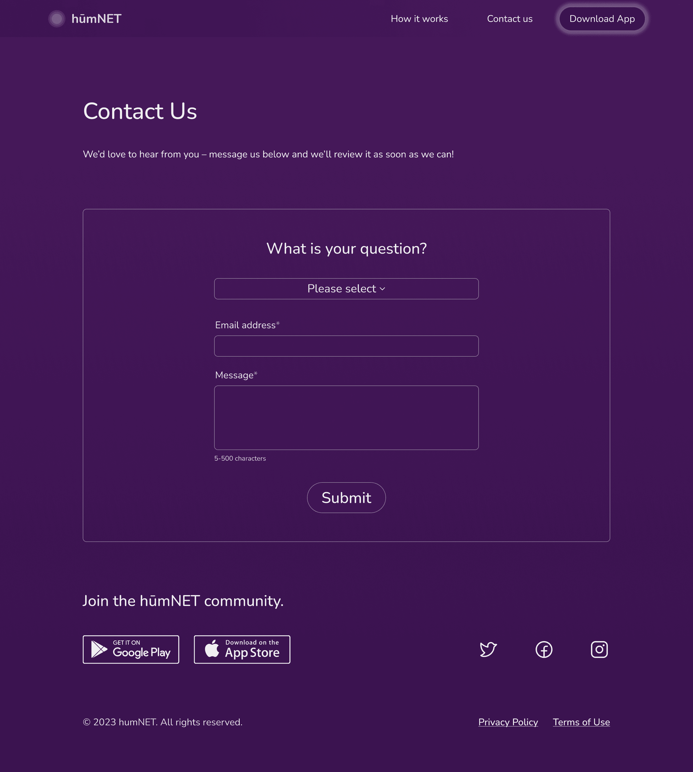
contact page
moving to high-fidelity
moving to high-fidelity brought on the most challenging parts of the project: the visual design (including color scheme, fonts, components, etc.) and content design (including copy and graphics).
to ensure consistency and sustainability throughout the desktop and mobile screens, i began by building a component library. i took inspiration from the hūmNET app.
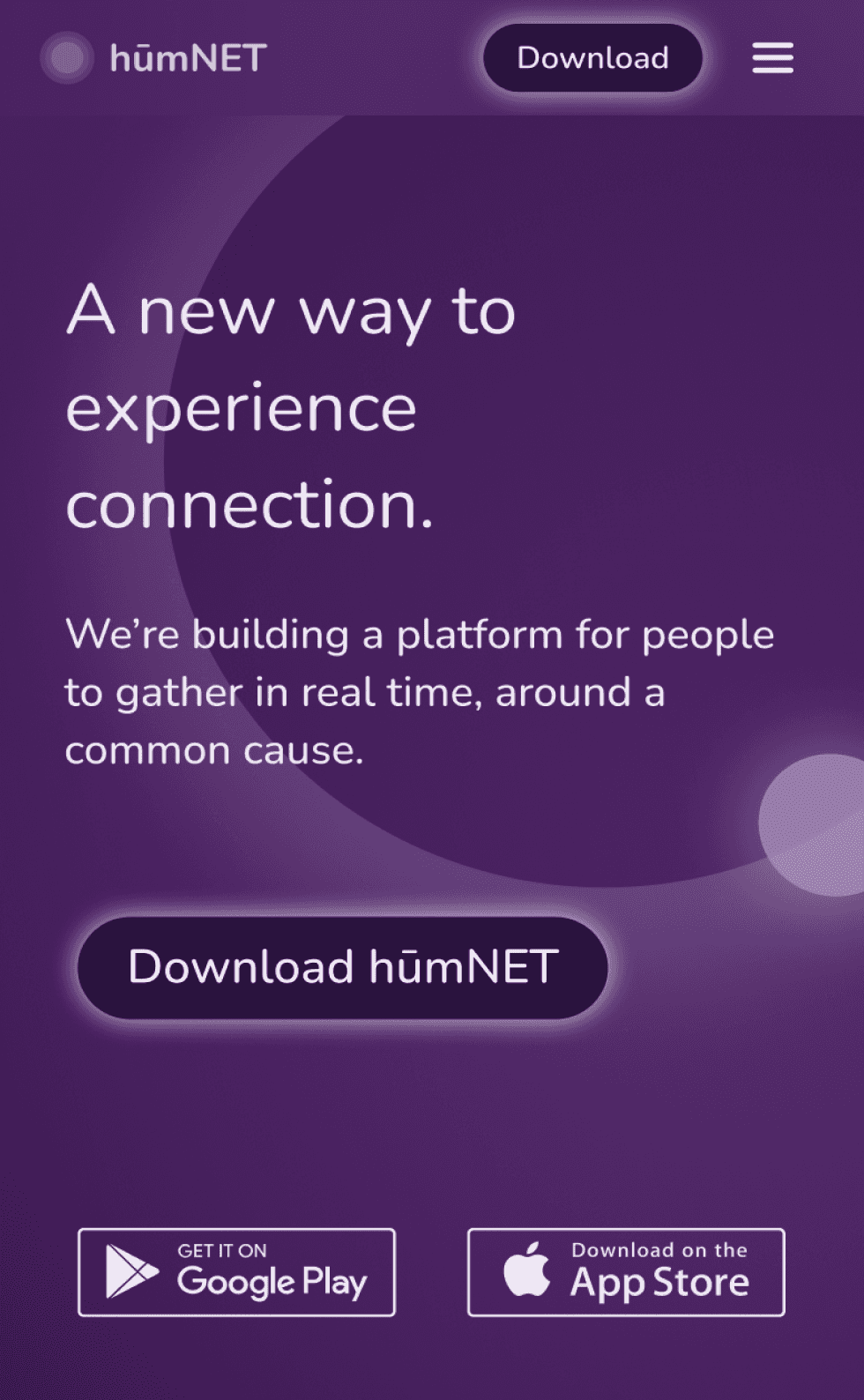
although i had sketched out the low-fidelity frames in desktop view, i designed mobile-first in Figma to keep content as refined as possible and promote SEO.
after multiple meetings with my client to make sure we were on the same page, i had a prototype that was ready for usability testing.
hi-fi mockups - desktop
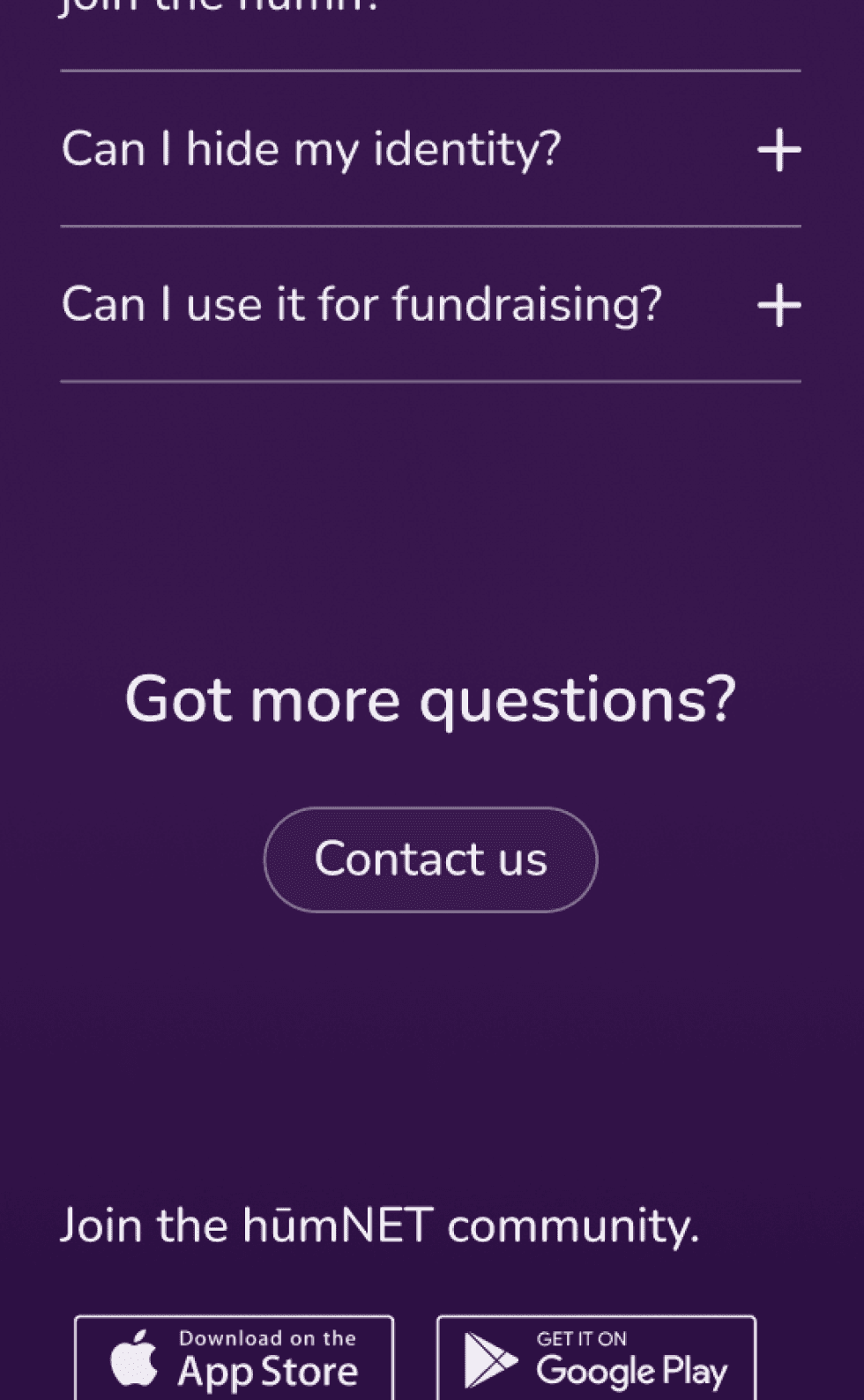
hi-fi prototype - mobile (v1)
usability testing uncovered a few opportunities for improvement: adjusting text sizing and text alignment, and adding and streamlining calls to action (CTA's).
adjusted text ALIGNMENT
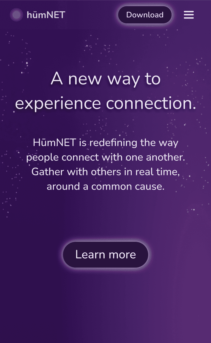
streamlined cta’s

adjusted text SIZING
added cta’s