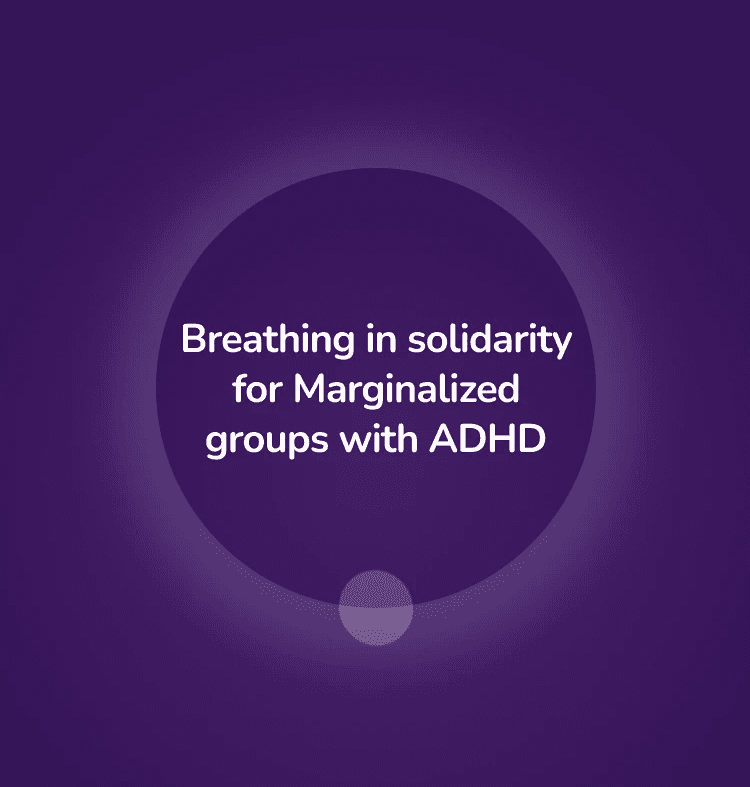
hūmNET is an early-stage startup founded by Darren Mark, an entrepreneur with a dream to give people around the world a way to connect over shared thoughts or feelings by attending meditative, in-app events called “humns” [huhmz].

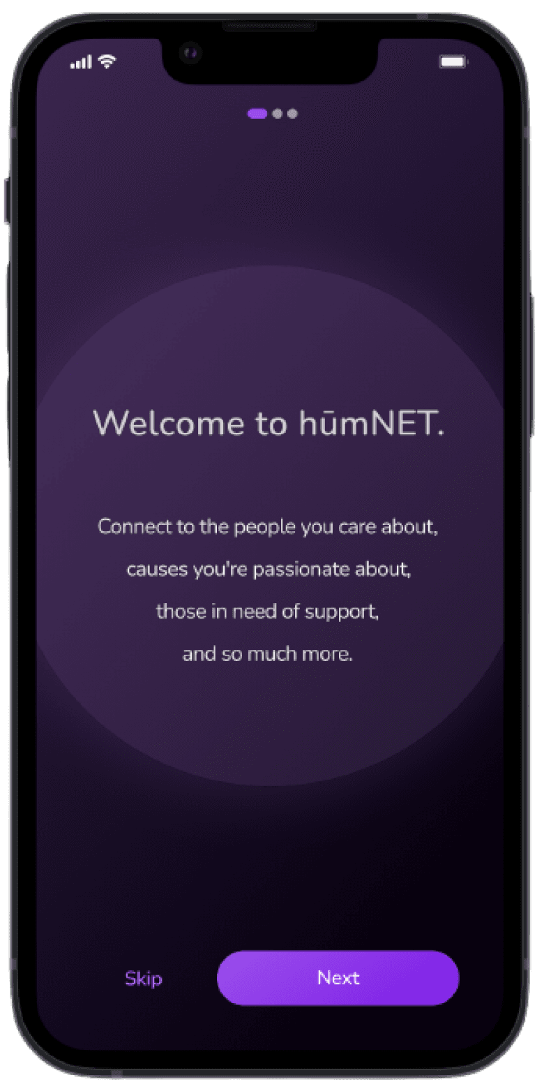
in 2021, Darren rushed out a MVP of the hūmNET app to iOS and Android app stores. while the app could (mostly) function, there were major usability issues - the design was unintuitive, inconsistent, and unfounded by research.
in june 2023, i was contracted to overhaul and redesign hūmNET's key feature: the humn experience.
before
after
i measured success by two main goals:
boost usability via System Usability Score (SUS)
System usability increased by 71%
promote customer satisfaction via Net Promoter Score (NPS)
⇪
NET PROMOTER SCORE REACHED 75 POINTS
we began by conducting heuristic analyses of the existing interface. Rana then conducted moderated usability tests with 3 target users, revealing that the average usability score was just 47.5 (compared to an average of 68).
together, heuristic analysis and user feedback revealed that the existing app had three major problems…
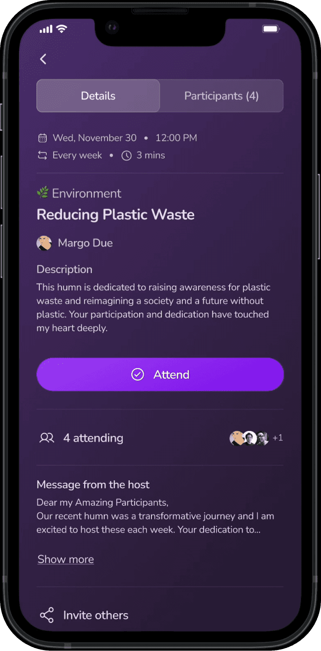
1) "What is this for?"
with event descriptions hidden in a bottom sheet, it was difficult for users to find the information they needed to sign up.

2) "How do i sign up?"
the small, unlabeled icons on the screen made it difficult for users to understand how to sign up to join a humn.

3) "what am i supposed to do?"
with no context and no apparent way to interact with a humn, users felt disconnected from the experience.
before addressing the major problems by changing or adding features, we broke down the existing flow into three distinct sub-flows:
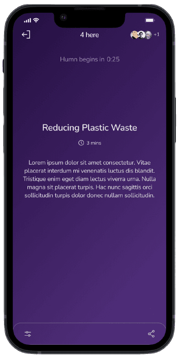
(1) before the humn ("pre-humn")
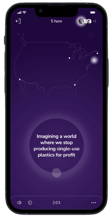
(2) during the humn ("humn")
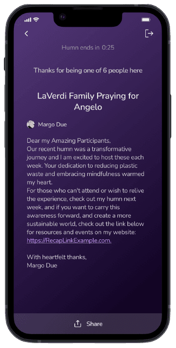
(3) after the humn ("post-humn")
from there, we began brainstorming features, organizing them into one of the three sub-flows. while we began by dreaming big, focusing on the main problems was more important, both in the interest of time and budget.
feature brainstorming

prioritizing
after collecting the features that we wanted to explore more, we utilized a prioritization matrix to narrow down even further, focusing on high impact features - both the "major projects" and the "quick wins".
a new sitemap
collecting the features revealed the need for another sub-flow: an "emotional on-ramp" to prepare users to enter a humn. with this in mind, i created a user flow that outlined the four sub-flows to design:
1) pre-humn
2) on-ramp (new)
3) humn
4) post-humn

wireframing
with the features nailed down and an existing framework for the main flow, i began working on the low-fidelity wireframes. this helped me make decisions around logic and interaction design.
mocking up my solution
with the final iterations decided on, it was time to bring them to high-fidelity. i built out a design system as i applied visual design to the wireframes, including color and text styles, UI components, and assets like backgrounds.

certain components were especially complex – the logic states for humn cards, for example, took a great deal of thought and conversations.

it was then time to string the screens together into four prototypes, one for each sub-flow. i designed the content to be as realistic as possible.
check out the changes below (updates are bolded).
with the prototypes finished, we conducted usability tests with five participants. the results were overwhelmingly positive: the usability scores had increased by over 30 points (71%), and the NPS score was 75.

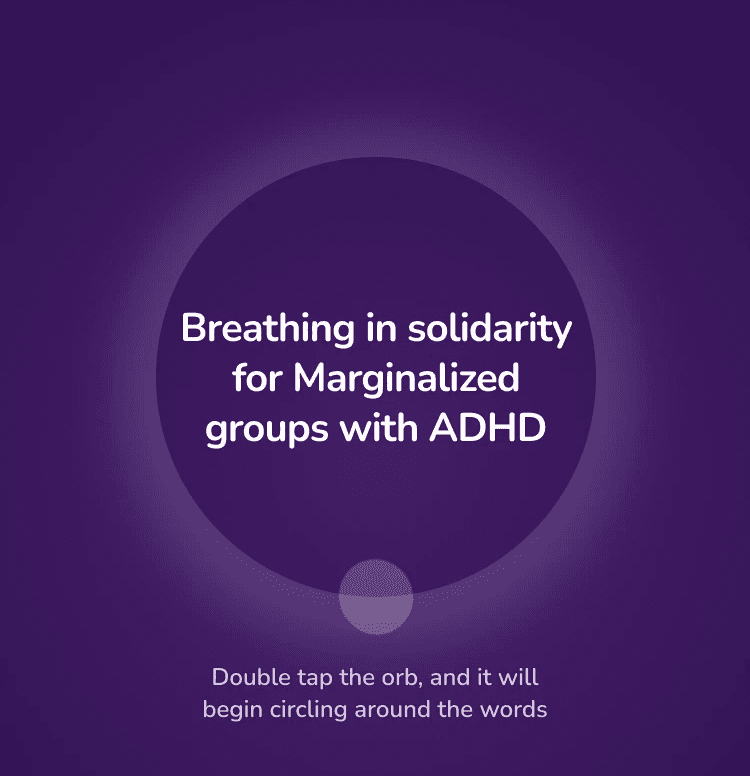
despite the massive improvements in usability, users still experienced confusion around three particular elements:
the "preferences" drawer
the on-ramp flow
the humn orb functionality
these indicated places where it would be best to simplify the design.
design updates


Before