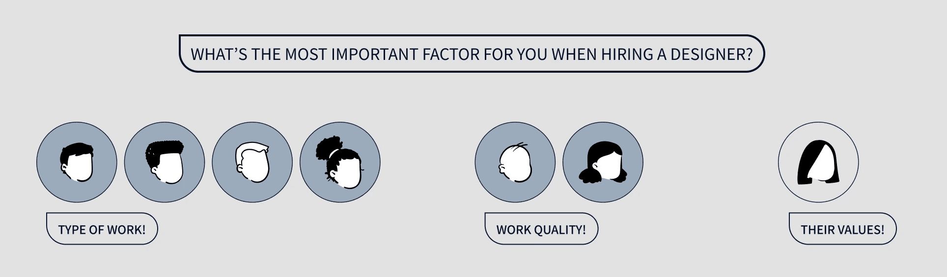
talking to users
to understand clients' perspectives, i decided to conduct user interviews with people who had hired freelance designers in the past.
among the interviewees, 6 of 7 stated that they found the specialty or quality of someone's past work to be the most important factors when deciding who to hire - as assessing past work was the easiest way to gauge someone's capabilities.
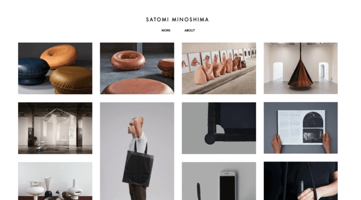
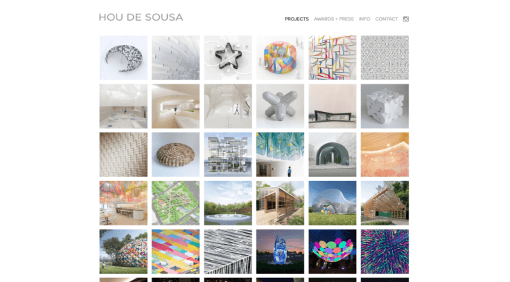
understanding competitors
to take a closer look into what makes for easy and efficient site navigation, i conducted a brief analysis of other design agencies. among the competitors, all had a very flat site structure, with their work readily and attractively displayed on their home page.

with these research findings in mind, it became clear that past projects needed to be readily visible and available to potential clients.
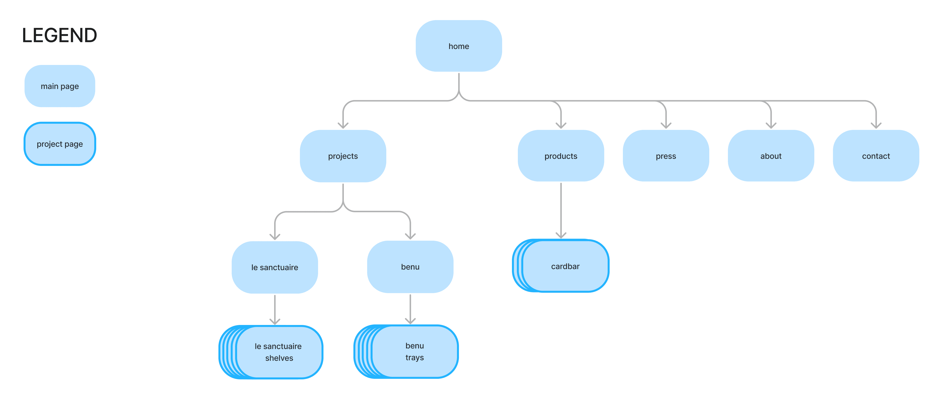
original sitemap
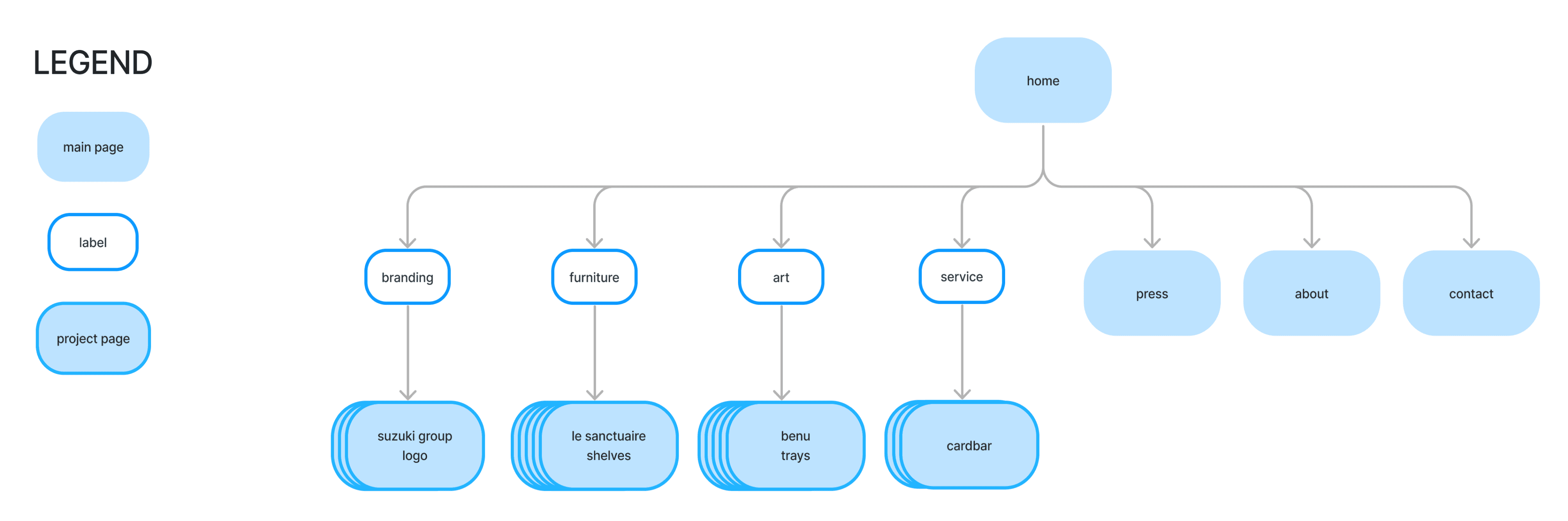
new sitemap
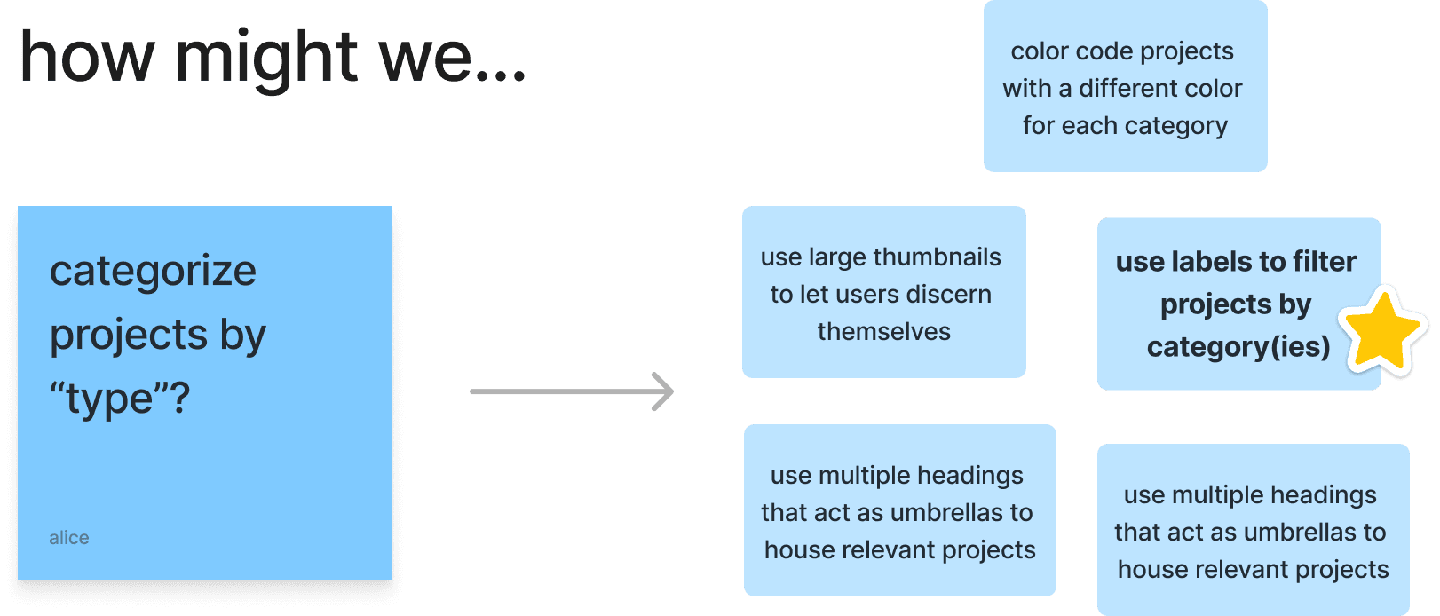
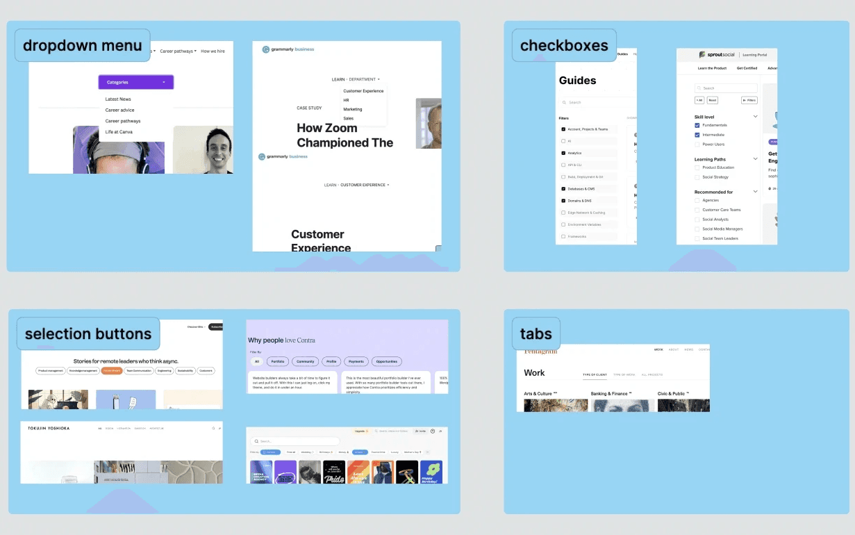
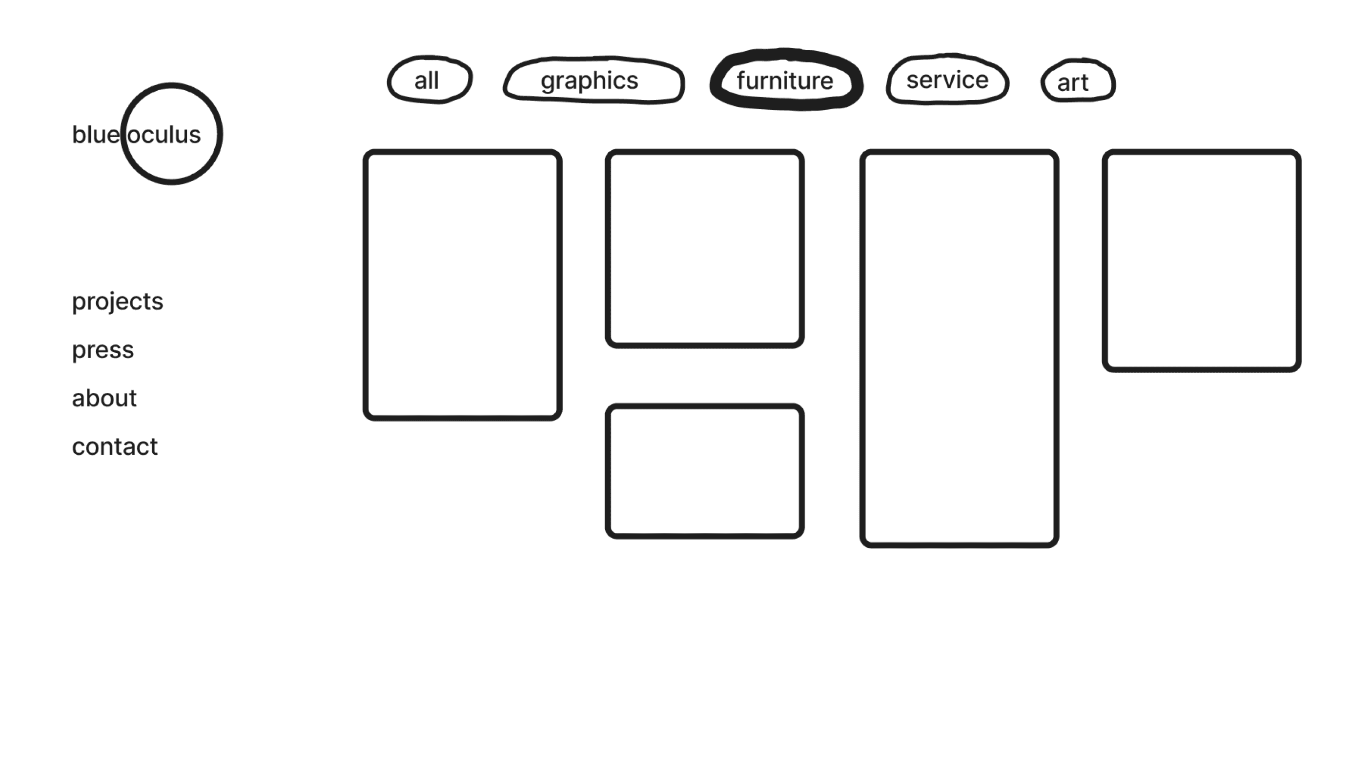
design patterns – filters
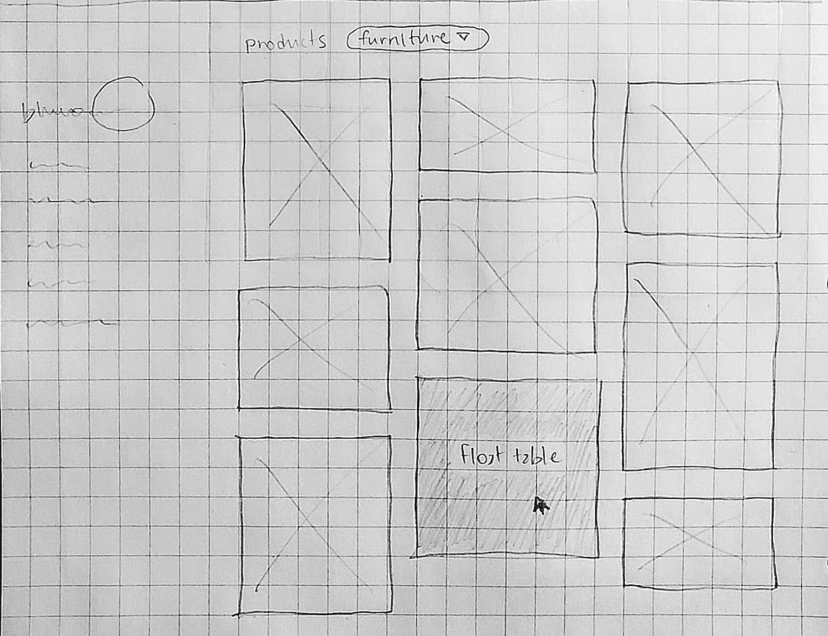
wireframes
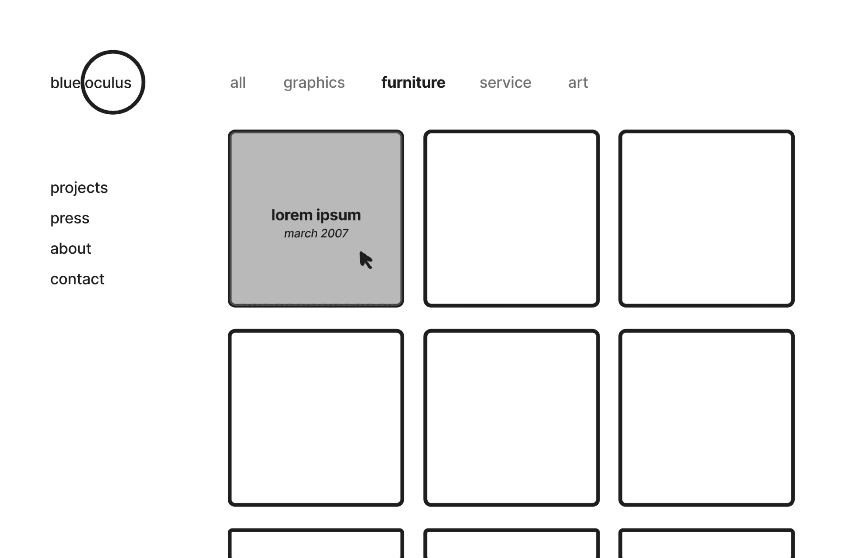
home page iterations
i explored a few ways to depict the filtering labels via sketch, and my client liked the simplicity of selection buttons in the form of plain words the best.
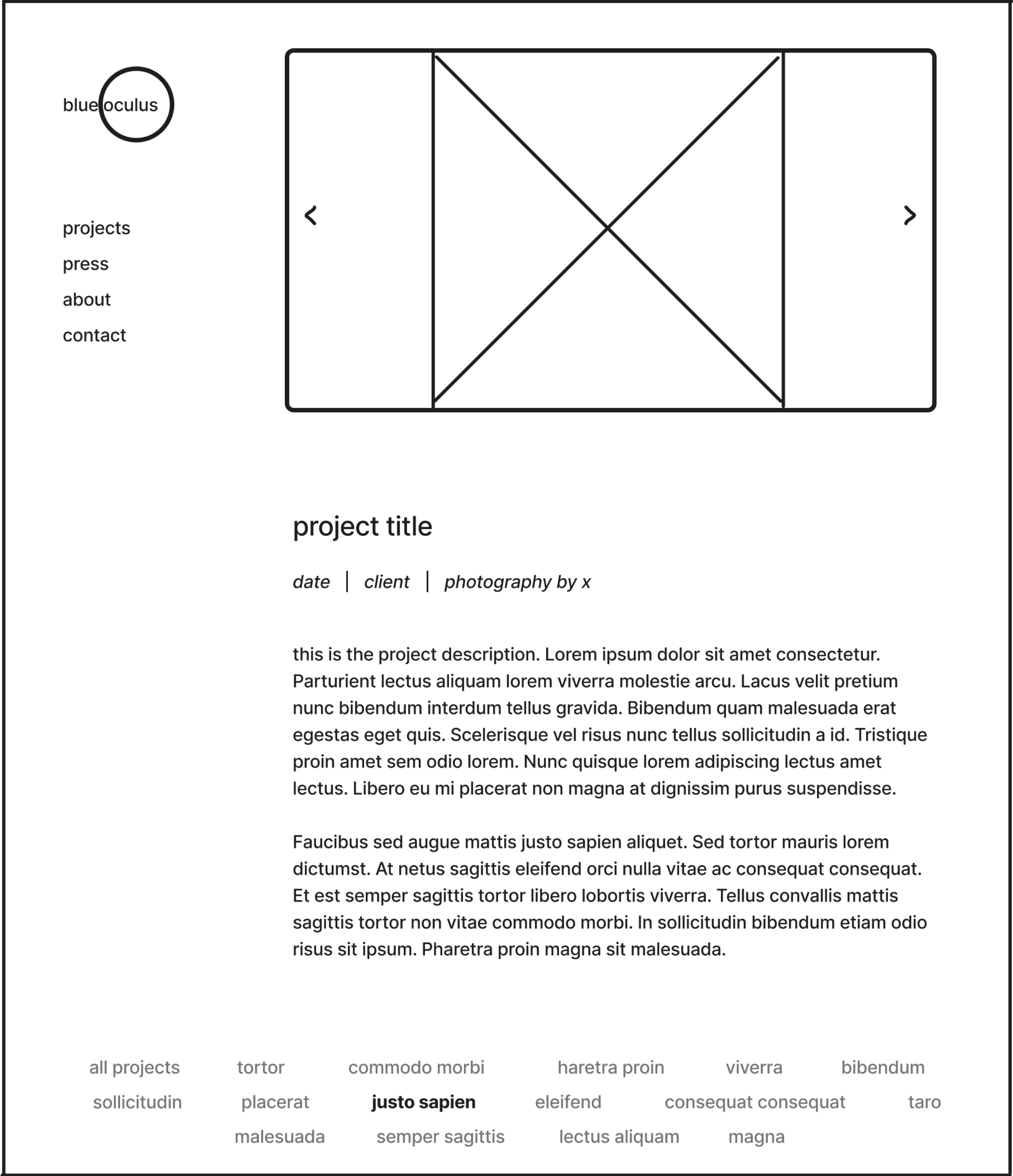
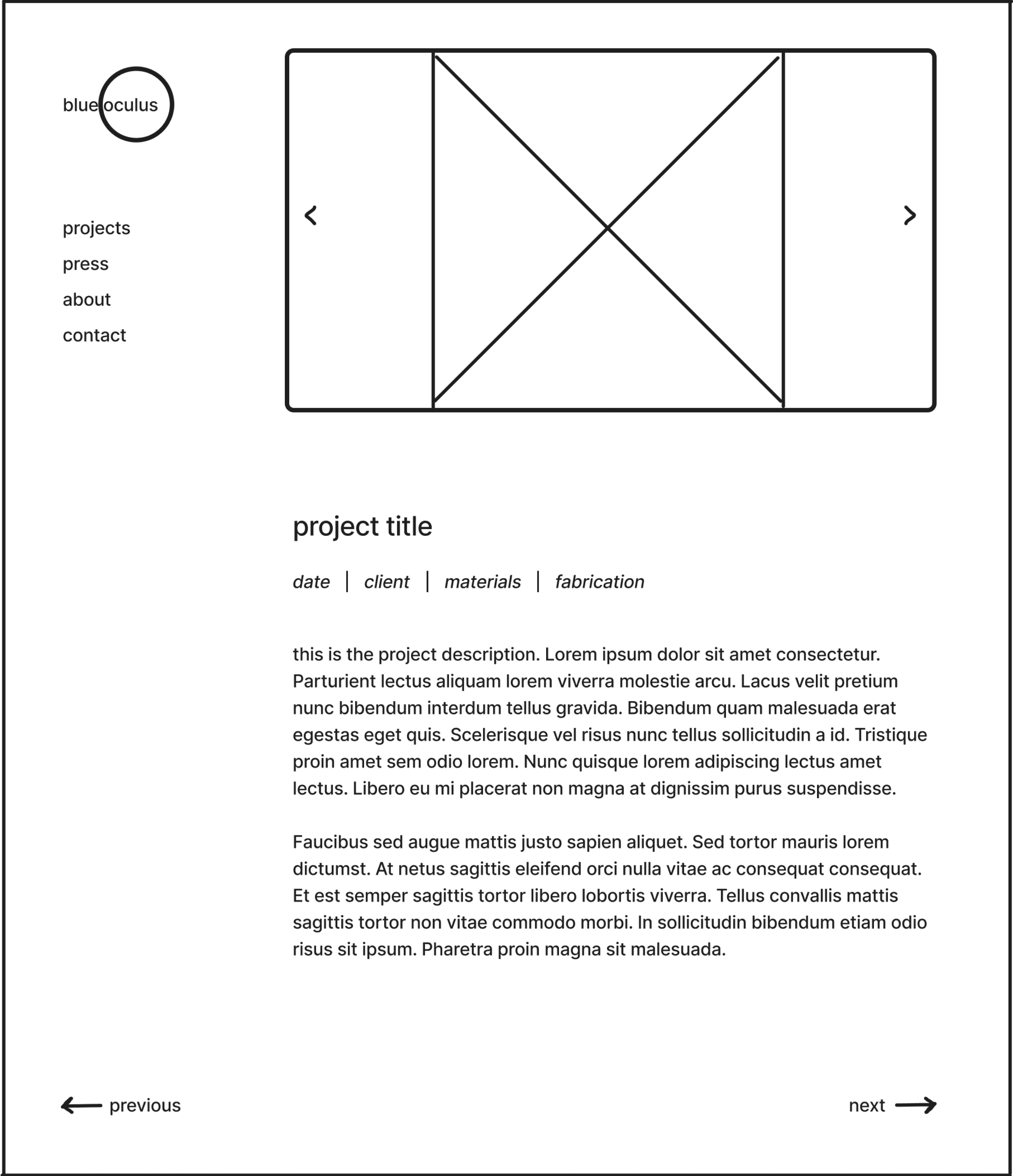
product page iterations
i made only minimal changes to the product pages: i added a photo carousel at the top to browse photos, and a way to navigate to other projects at the bottom.
finally, i began recreating my sketches in Figma, starting with the home page and then moving to the project pages. once all of the elements were in place, i connected the elements together to create a clickable, high-fidelity prototype.

home page
product page

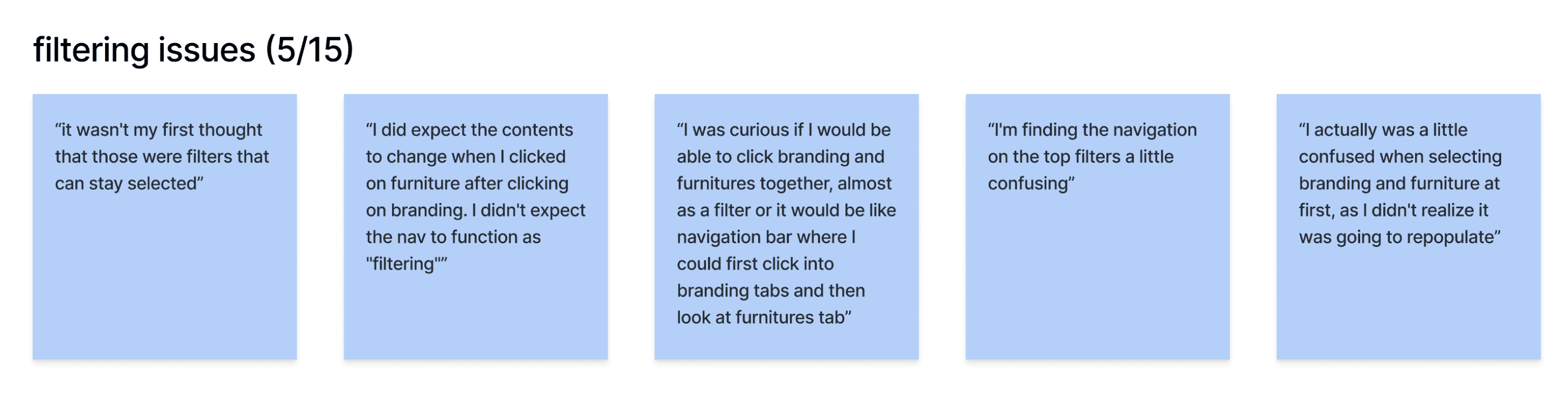
don't make filter buttons sticky on the home page
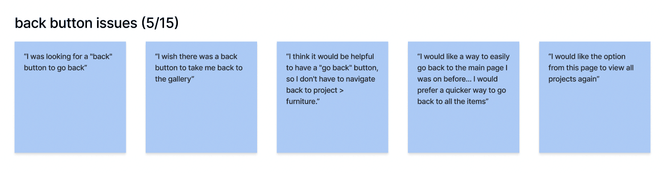
add a back button to the project pages